
When it comes to painting, your home’s exterior is a huge blank canvas. And it can be intimidating to choose a colour palette to coat all those surfaces. What’s worse is that if you don’t like the outcome of your paint job, there’s only one option: Paint it all again. So, how can you ensure that you land on the right colour the first time? And what colours and colour schemes should you avoid? Well, we’ve addressed those questions and more with our tips listed below. As always, you can count on our professional painting crew for exterior home painting services once you’ve settled on the perfect colour for your abode — Integrity Painting provides painting services for folks throughout Winnipeg.
Out-of-Place Exteriors
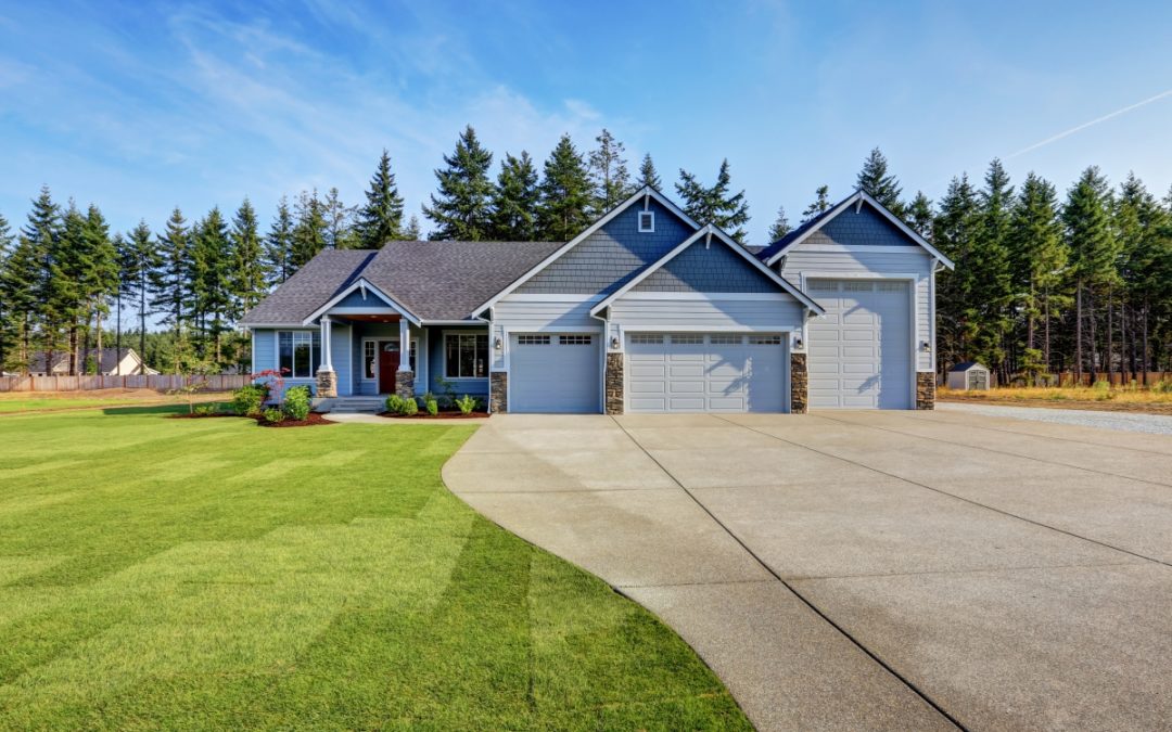
First thing’s first, think about the materials of the exterior of your home. Perhaps you have exposed, red brick, as well as a few pillars made of grey, flat stone. If you’re not planning on painting these surfaces (surely you wouldn’t paint that beautiful rock surface), then you should plan around these components. Select a colour that will work well with that brick and stone, instead of something that appears out of place. For instance, a pale-blue would work well atop those grey stones, and it would help to highlight the red of the exposed brick. On the other hand, a bright green will look gaudy and loud against the more natural tones that are incorporated in your home.

Mismatched, Gaudy Colours
Speaking of gaudy, you’ll want to avoid hues that simply don’t work well together. Since your home has a large exterior surface, it’s likely that you’ll want to paint with colours that are relatively quiet. Think about neutral tones, whites and off-whites, and washed-out hues. While you can certainly opt to include a bold accent in the composition (perhaps a rust red just under the gable at the peak of your garage), you wouldn’t want to pair that red with bright purple, which will prove too bold.
Overwhelming Bold Colours
While we’re talking about bold colours, you should be mindful that brighter, more vibrant colours should only be used on very small homes or as accent colours. Bold colours on larger homes can stick out like a sore thumb, which can actually decrease the value of the home, should you choose to put it on the market anytime in the future. Instead, use more muted hues throughout your home’s exterior, and only use bold colours as accents (e.g. trim, window shutters, gables).
Colours That Don’t Fit the Surroundings
Look around your neighborhood. Is there a colour scheme that seems to permeate throughout the area? Would firetruck red look odd next to a home that is grey and a home that is tan? If you’re in a neighborhood with homes that are similar to yours, you should consider your surroundings and plan accordingly. Pick a colour that suits the character of the neighborhood, and feel free to talk to nearby neighbors if you’d like some input.
Too Similar to the Interior
Folks often overlook this last tip: You shouldn’t paint your home’s exterior the same colour as its interior. This can be oddly jarring for guests to your abode. Instead, consider colour schemes that compliment each other, giving your home a contiguous character and aesthetic that is pleasing as you move from the outdoor space to the indoor space. If you just have to use a specific colour, you can select an exterior colour that is a few shades or hues different than that which you use on the inside of the home.
Need Tips? Count on Integrity
Still can’t decide? We’d be happy to help. We provide colour consultation services alongside our exterior painting services, so that you’re sure to settle on the best colour that you desire. Feel free to reach out to us to learn more or to schedule an appointment — again, we provide residential painting services for our neighbors throughout Winnipeg!
Recent Comments