
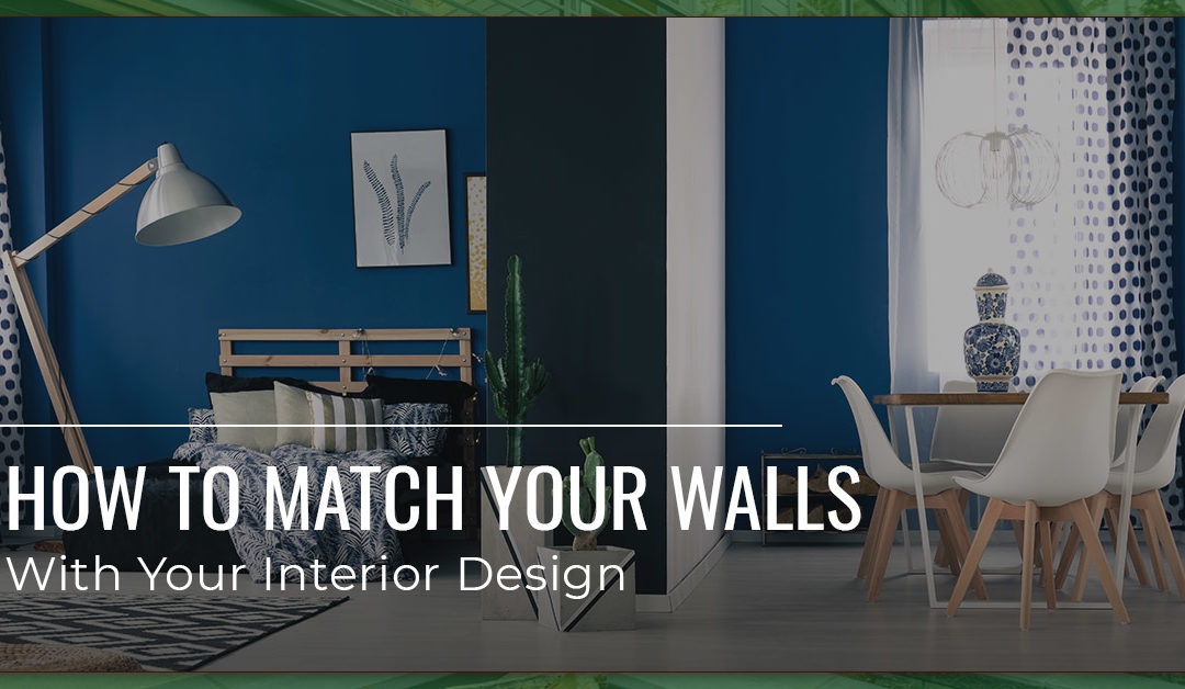
Okay, so you’ve finally painted over that awful bubblegum pink colour that the previous homeowner decided to whitewash throughout the walls of your home. You’ve opted for a bit more tasteful selection of mint greens, off-whites, and milky chocolate browns. And now that you’re content with the walls, it’s time to upgrade the furniture and fixtures of your spaces. Where to begin? If you’re content with the interior wall paint of your abode, but now your furnishings look outdated (or entirely out of place), then it’s time to donate those old items and replace them with new, more fitting furnishings. We’ve collected a few tips that you can employ to ensure that your furnishings work well with the updated walls of your home. Here’s our advice — as provided by Integrity Painting, Winnipeg’s local source for interior and exterior home painting…
An Extended Colour Palette
First thing’s first, you can establish an extended colour palette to build off of the colours that you already have throughout your home. Consider the colours of your walls, your flooring, cabinetry, your countertops, tiling, and other fixtures and facets that are more or less attached to your home. Since you’re adapting to the colours of these components, you can start to build a colour palette that works well with the existing condition of your home. Extend the current colour palette with additional colours that work well together.
Let’s head into the kitchen for a hypothetical situation. If you have robin’s egg blue walls, white tile backsplashes, and light wood cabinetry and flooring, then you have a vibrant, clean, airy kitchen. You can continue this theme with additional features that are exciting, warm, and welcoming. From this starting point, you can opt for a dazzling copper pot hanger dangling from the ceiling, a vibrant collection of pots (maybe a compilation of terra cotta colours and navy blue) and plants (you’ve always liked succulents) by the window. Maybe you’re going to go with retro, yellow-topped bar stools to abutt the high top counter peninsula of your kitchen. And you’re considering investing in a firetruck red tea kettle to finish the whole composition. This can prove to be an excellent extended colour palette, with warm, exciting primary colours, featuring natural accents (with the copper and plants).
When building your colour palette, you can add colours that are similar each other (colours on the same side of the colour wheel), as well as colours that contrast each other (colours on opposing sides of the wheel). You can also opt for a set of colours, like primary or secondary colours, as we described in the example above. Once you have a colour set in mind, you can move on.

Think Big
Now that you have a general colour palette, you should consider the largest items of your home. Think about the couches of your living room, the dining room table, the cabinetry of the kitchen, the vanity and cupboards of your bathroom, etc. These larger items will hold the most weight in the composition of your home, and they should be considered first if you’re selecting a palette of colours and textures for your abode’s interior. Be sure to consider how these furnishings will work with each other, as well as the colours of your walls, your floors, and the lighting throughout your home.
Let’s take the living room coffee table as an example, and let’s say that your living room features a red brick chimney, warm natural wood floors, and a vintage, heirloom rug from your great grandparents — oh, and the walls are painted a tasteful seafoam green. Now you have a great start: warm, natural wood meets highly textured red bricks and a colourful carpet, which are all accented by the quiet seafoam walls. Your coffee table should follow suit with that theme. Consider something natural: perhaps a reclaimed wood table, or a slab table created from burled wood and epoxy filling. You really shouldn’t have anything overly modern in this setting. A glass table with metal legs, for instance, will look out of place among all of the other components of your living room.
Starting with the largest furnishings of your interior space will give you a good baseline to build from as you move towards the smaller, more accenting items of your abode. Just be wary that these larger items shouldn’t be too overwhelming, since they’re already big. So steer clear of a big, mustard yellow couch for your furniture. Instead, maybe a charcoal grey number will do the trick.
On Mixing and Matching
Mixing and matching your furnishings with the colours of your home is a subtle art, and it can prove tricky. While you may be tempted to perfectly match your furnishings with the paint colours of your walls, you should be wary that this can be overwhelming, and it will force your furnshings to, well, “melt” into the walls that they abutt. Instead, if you’re matching your furnishings with your walls, you should opt for colours that are similar, but not exactly the same. Go a few shades lighter or darker, or opt for a hue that’s a few degrees off from the paint colour that you chose.
If you’re mixing colours throughout your space, you should also be wary that too much colour can prove to be a problem. If you find yourself surrounded by a broad smattering of pastels, the room will feel disjointed, even though that colour palette looks good on paper. Instead, mix and match your furnishings selectively, and get creative with a few select items — not every stick of furniture in the space.
The Final Touches
It may seem counterintuitive, but the smallest items in your space may actually demand the most attention. As such, you should take extra care to select these items. Fortunately, this often proves to be the most fun for homeowners who are designing their homes’ interiors!
Let’s delve into an example: the centerpiece of your dining room table. Now, a centerpiece is an obvious accent for the dining room, and even a small vase of flowers can prove to be impactful. A few daisies can prove to be the perfect temporary accent for your dining room, especially if, for instance, you have an open home layout whose dining room bleeds into the kitchen, where the walls are yellow and the cabinets are whitewashed. Even if your dining room is painted avocado green, the daisies will draw the eye throughout the space. This effectively builds a story in your home: Cooking and creation started over there in the kitchen, and the final product will be enjoyed here in the dining room. In this way, a small accent can prove powerful to make your home’s spaces a composition.
Think about the final touches and small accents of your home as a painter would. For instance, a small red cherry will gain as much attention as the spruce-green table on which it rests. Get creative in selecting the final touches for your interior design, and enjoy how impactful they can prove to be!
Your Project Starts Here
Whether you’re ready to paint your walls to cap off your home’s interior design, or you’d like to start your home update with a few coats of paint, you can count on the crew here at Integrity Painting to make the most of your abode. We provide both interior and exterior painting for homeowners throughout Winnipeg, and we’d be ecstatic to help you make the most of your space. Just give us a call to start (or finish!) your project!
Recent Comments