fbpx

It may be surprising to some, but the colours that surround us can have an effect on our moods and productivity. There is a whole colour theory that revolves around the energy that is created with certain colours. In fact, since 1984 when colour psychologist Angela Wright developed a Colour Affects System, interior designers and psychologists have been studying colours, the combination of different colours, and the different moods and energies that are created in various spaces. So, if you’re painting a restaurant, you probably wouldn’t choose the same colour as a medical office. Or if you’re painting a commercial sales space, it wouldn’t be the same colour as a therapist’s office. Depending on the space and the desired energy, you’ll choose a colour that helps set that tone and mood.

Which Colours Create Which Type of Energy?

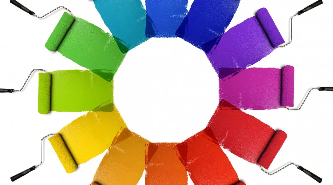
Rather than using a three-primary colour wheel, Angela Wright used a four-primary colour wheel (how many primary colours there are has actually been debated for hundreds of years by people like Leonardo da Vinci, Sir Isaac Newton, and 19th century writer J.W. von Goethe). Using blue, red, yellow, and green, Ms. Wright determined that each colour has an effect on our moods.

  • Blue: The colour blue has an overall impact on our minds, meaning that the colour can stimulate our brain and help increase our productivity. Certain hues of blue help us remain focused, especially in industries that require repetitive work.
  • Red: This colour stimulates our bodies, increasing the intensity of our emotions and even causing feelings of anxiety or urgency. Red is often used for spaces that demand high levels of energy.
  • Yellow: Yellow stimulates our emotions, encouraging feelings of happiness and it can stimulate mental activity. Yellow is often used for creative environments.
  • Green: The colour green is associated with balance, calmness, and reassurance. It is also associated with money, making it a good colour for offices and especially financial workplaces.

Combining Colours

Even though there are only four primary colours used in Angela Wright’s colour theory, there are obviously thousands of colours to choose from when you’re painting your office. By combining blue and yellow, for example, the shade of green that is produced depends on the hues of blue and yellow that are mixed together. And when you mix red and yellow to make orange, the colour orange also has a specific energy associated with it. The colour orange is a great example of the combination of energies that can also be created when two primary colours are mixed. The passion and intensity of red, combined with the increase in mental activity from yellow makes for a very energetic and active colour and environment.

So What Colours Are Best For Your Office?

Off-White

The trick with using white in your office is to choose a shade that is not true white, which tends to be off putting and very clinical. Choosing an off-white, like an eggshell or a light shade of beige can soften the space, making it easier on the eyes. With an off-white foundation to the design, you can then incorporate secondary colours to keep the space from looking sterile. Choose secondary colours that represent the energy that is you want to achieve for your office and your industry.

Teal

The combination of green and blue will help create an atmosphere that stimulates productivity, but still has a calm and reassuring vibe. If you select teal as a main office colour, be sure to select a hue that is not too blue or too green, which can be overpowering in one direction or the other. Unless you are aiming to create a calm environment in your office, for possibly a therapist or a doctor’s office where the patient’s energy is the focus, a workspace that is too calm may have an impact on employee productivity.

Grey

Grey is created when mixing white and black, which are both neutral colours, resulting in a very neutral environment. Keep in mind, though, that many greys often have a slight coloured hue to them, often either blue, red, or yellow. It can be difficult for many people to visually identify whether a grey has these undertones to it, but when other colours or accents are added to the space, it will bring out the undertone colour, emphasizing that related energy. In many corporate environments, a blue-grey hue is chosen to create a neutral and slightly calming mood.

Light Blue

A bold shade of blue can be overpowering in many commercial spaces, so going with a lighter, more pastel shade can balance things out and create a mood that is similar to certain shades of green. Light blues are great for professional environments that need to be productive, yet still relaxed and focused. Light shades of blue are a good choice for doctor’s offices as well.

Brown

Brown is created by combining a primary colour with its complementary colour. If you study a colour wheel, you’ll see that complementary colours are directly across from a primary colour. You can also think about it as taking a single primary colour, red for example, and mixing the colour that is created when the remaining two primary colours are combined, which would be yellow and blue, when mixed created green — red and green are complementary colours. Because brown is created using several colours, it can have undertones of one of those colours. Whichever hue of brown you choose, it often creates a powerful and strong environment, a great choice for lawyers.

Light Yellow

If you’re hoping to keep your creative juices flowing, a light, pastel yellow will help set the tone. Yellow, in general, is a very encouraging colour, making it easier to stick with certain projects or tasks. Just avoid going with a shade that is too bright, which can be distracting and overstimulating. A butter yellow or ivory will keep things on the milder side. Yellow can also lean toward a brown or gold hue, which could be a good choice for a sophisticated energy.

Purple

A combination of red and blue, purple has a wide range of shades to it, anywhere from light pastel purple to a deeper, bluer purple, or even a red-heavy purple, or maroon. When you want to paint your office a shade of purple, go back to what energy you want to create. If you’re looking for a more energetic and powerful environment, a red-tone purple will fit better. If you want a blue-heavy purple, it will help create a more soothing, yet still productive space.

Green

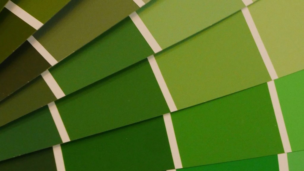
As we mentioned above, green is a great colour for financial industries; however, it does greatly depend on the shade. Deeper greens may fit better for finance, but if you work in the healthcare industry, a lighter, softer green is a better choice. Think again of how green is created — with yellow and blue. A green that is too yellow will stimulate the senses, and a green that is bluer will add a sense of calmness.

Orange

Definitely one of the more intense colours, closely examine the type of energy and mood you want to create in your office before painting walls or other surfaces with orange. Created by combining red and yellow, these primary colours offer the most energy and intensity, and so orange also gives off a very powerful and busy energy. Orange is a great choice for busy sales offices where employees need to be energized by their surroundings. For a balanced mood, orange is often combined with greys or blues.

Whether you’re trying to achieve a calm and soothing office, pump up the energy, or set the mood for a professional business environment, the colour you choose will make all the difference. The colours above are just a starting point, an inspiration to help you narrow down the decision to an overall colour. Then from there, you can choose a shade that fits your style or that matches any existing decor.

Work With Professional Commercial Painters

While the colour of paint is up to you, the painters at Integrity Painting can guarantee that the finished commercial space will look amazing when it’s done. Since 1992 Integrity Painting has been completing commercial painting jobs throughout the Winnipeg area. We understand what it takes to do the job right, on time, and on budget. You’ll never see splattered paint on the floors of windows, corners are always protected to keep paint from going where it shouldn’t, and each surface receives a smooth layer of paint without any brushstrokes.

If you’re looking to hire a commercial painter, look to Integrity Painting for honest and passionate service. Schedule a free quote today.